How to Style Maps by Categories or Quantities?
Styling maps efficiently can make your geographic data appealing and easier to understand. You are able to outline patterns, relations, or trends on your map by categorizing or quantifying data. Follow these steps on how to style maps by categories or quantities in a simple yet efficient manner.
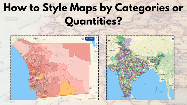
Understanding Categories vs. Quantities
Categories: Use for distinct groups like land types (urban, rural) or regions (countries, states).
Quantities: Use for numerical ranges such as population density, temperature, or revenue.
Steps to Style Maps
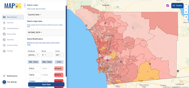
Define Your Data
Organize your data into categories or numerical ranges. For example, classify regions by climate types or population levels.Choose a Style Type
Categorical Styling: Assign unique colors or patterns to each category to the layer you’ve added by style data, then select the attribute you want the Category Style on. For instance, represent forests in green and water bodies in blue.

Quantitative Styling: Use gradient shades by Quantity Style to represent ranges. A darker shade could signify higher values, like population density, income data or more.
Apply Visual Elements
Use symbols, size variations, or patterns to represent data differences.
Add labels to enhance clarity for specific categories or quantities.
Use various kinds of basemaps to enhance the visualization
Test and Adjust
View your map on different devices and adjust colors or patterns for better accessibility.
Why Styling Matters
Improving data interpretation and decision making, well-styled maps are an example of how population density in a gradient on a map can help urban planners properly allocate resources.
Explore Advanced Features
If you are looking for a user-friendly platform to practice this, you might want to try tools like MAPOG. They offer features such as Category, quantity, heatmap styling and more, allowing you to experiment with a variety of datasets in a visual storytelling format.
Final Thought
Styling maps is an art and a science. The best design choices transform data into actionable insights to make your map functional and also visually engaging.