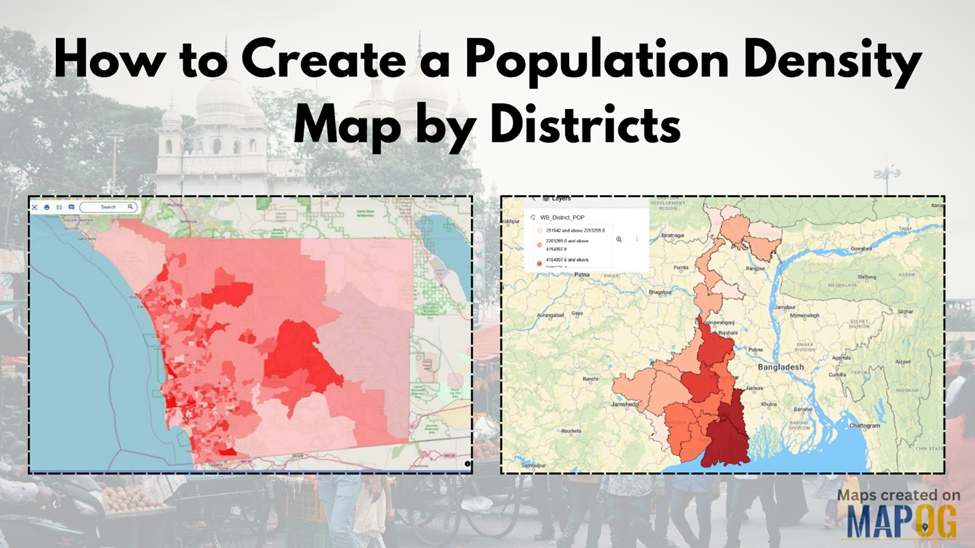
Understanding Population Density Map by Districts
Population is never spread evenly across a region. In countries with rapidly urbanizing districts and resource gaps, understanding where people live is more than just a curiosity—it’s a necessity. From managing urban infrastructure to planning disaster relief, population density maps by districts offer a smart visual solution. Yet, one recurring issue in decision-making is the lack of clarity when looking at tabular or static data. That’s where interactive geographic visualization steps in. By transforming raw population data into district-based maps, professionals can interpret spatial patterns more intuitively and make informed choices with ease.
GIS and the Power Behind Density Mapping
Geographic Information Systems (GIS) have long helped researchers and policymakers analyze spatial relationships. When it comes to population data, GIS allows users to overlay demographic statistics on district-level boundaries and style them visually—often using a quantitative color gradient—to reflect population per square kilometer. This makes it easy to spot overcrowded areas or underpopulated zones at a glance.
Interactive population density maps aren’t just for planners or researchers. They’re being adopted widely across different sectors. Public health officials use them to map hospital access in high-density zones, while telecom companies use them to plan tower locations. Education departments rely on these maps to predict the need for new schools, especially in fast-growing districts. Even retailers use district-level population heatmaps to guide their store placement strategy.
How Visual Mapping Makes a Difference
When users upload a vector layer—such as a shapefile or GeoJSON containing district boundaries and population figures—they can instantly visualize the demographic spread with simple symbology tools. Applying a ‘quantity style’ helps translate abstract numbers into layered visuals. Light colors can represent sparsely populated districts, while darker shades highlight densely populated ones. This visual shift empowers users to prioritize actions based on real patterns, not assumptions.
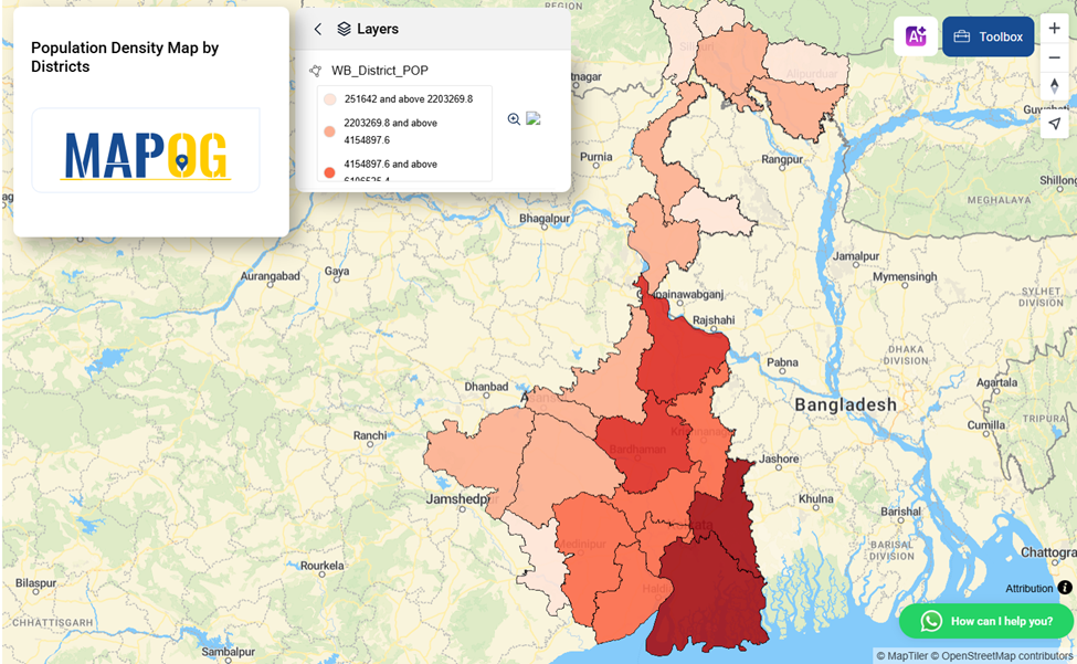
One such platform where you can do this effectively, without needing high-level GIS training, is platforms like MAPOG. It offers a straightforward interface to upload district-level data and apply thematic styling with just a few clicks. While it’s not the only option, it’s a user-friendly space to begin mapping population patterns interactively and share them with teams or stakeholders.
Conclusion: A Map is More Than a Picture—It’s a Planning Tool
Visualizing population by district isn’t just a technical exercise—it’s a strategic one. If you’re someone who works with demographic data, policy design, or resource planning, don’t rely solely on spreadsheets. Explore tools that let you turn data into visual stories, like MAPOG. A well-styled population density map may not solve all your challenges—but it’ll show you exactly where to start.